As promised, here are some installation shots:
 My ultra-fancy wall label
 Look at all the people!
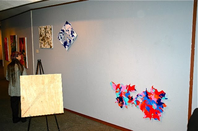 All of the better quality photos were taken by my Uncle Rick, who came to the opening and reads this blog. Thanks Uncle Rick!
 Various people throughout the evening asked me about the arrangement of my work on the wall, which made me really happy because the whole point was to get them to look and consider the work beyond the straightforward "oh, huh, this is what this student made this semester" line of thinking. I wanted the placement to act as a compositional element that elaborated upon the movement within the pieces. I felt like arranging them this way just suited them better than a straightforward 1,2,3 kind of presentation because the pieces themselves are pretty nontraditional. I was also extremely pleased by the fact that the wall I got was gray and not white.


And because this is new work, I'll include some closer shots so you can maybe see the some of the more minute details:
 You might not really be able to see it, but this was painted using an iridescent silver oil stick, so the surface shimmers. People liked this one a lot.
 This is one of the wood relief pieces that weren't ready to be posted earlier. I attached the pieces of wood in a way that allowed for spacial depth and shadows. There are hints of pink in it that you can't really see here. I didn't paint it as a diamond, but chose to hang it that way for the show (part of the mission to make everything dynamic. I think it worked).
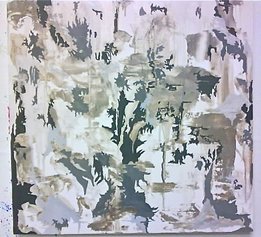
 This one's just difficult to portray accurately. Like the other relief piece, it's made of a bunch of adhered pieces of plywood that I cut out on a band saw, so there is dimension to it (which is sort of apparent from the shadows), though these pieces were adhered directly, so it's flatter. Additionally, there are the interior shapes that augment the harder lines of the original wood cutout shapes. And some of the color variations are more subtle, like in that lower right orange area (there are two distinct shades of orange happening in there). Anyway, people seemed to connect with it, and that's all that really matters.
So there you have it! Even though the semester's pretty much over, I'm still going to be working in my studio for a few more weeks, and then next semester will start and I'll have even more things to share. I'm making a book out of a series of monoprints, and I'm still expecting wood to make some large stretchers. We'll see what happens!
No comments:
Post a Comment